Hello, glad to see you back! In the last blog post I introduced the key design drivers and the high-level design concepts for a new “Graphene UI” for SDL Tridion Sites. I also explained how it could address the workflows, needs and requirements of agile marketing teams running global web projects.
For this post, I will dive into the design concepts through which we aim to address the challenges and needs of our tech-savvy implementation and expert user community. So, let’s have a look into BluePrinting, Content Management, Content Mashups and Channels, and how to configure and set up Tridion DX in the new Graphene UI.
BluePrinting
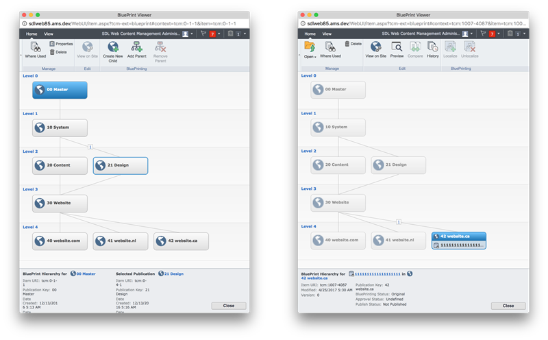
BluePrinting makes SDL Tridion Sites as powerful and successful as it is, so we would like to expose and integrate it in a much more pervasive way. The example below shows a small example BluePrinting hierarchy in it's current outlet in the UI, the BluePrint viewer. It allows advanced users and implementers to define and manage a large number of content publications, including their mutual relationships to each other.
Visualizing the BluePrint Hierarchy
Our design direction takes this current visualization approach and embeds the BluePrint hierarchy more seamlessly into the context of work, right next to the content a user is editing or managing. An implementer might need it when setting up and configuring content publications, an editor while deciding to either edit the "parent" of an article component in a lower BluePrint level, or to better localize it and break the inheritance. For both cases we integrated the BluePrint hierarchy as as an alternative “view” on the list, so you can display any selected item in it's BluePrint context at all time.
From an implementation perspective, we think that the exact visualization of the BluePrint hierarchy should remain flexible through the use of modern, interactive, browser-based visualization methods and frameworks so it can be extended and adjusted as needed.
There are so many different visualization techniques for data and information, why stick to one? Implementers should be able to define and plug-in their own if necessary and appropriate. As a start, we experimented with scalable hierarchical tree-type visualization that scale well, can be zoomed, and through which users will be able to interact with the nodes as an alternative way to manage and set up the BluePrint. See some examples from the D3 community:
Visualizing Content, Relationships, Dependencies, etc.
And while we are talking about visualization techniques for data, think about other lists, items, relationships, etc. in Tridion Sites that could be visualized too. See some examples below to spark your imagination.
We as humans evolved into incredible pattern recognition machines over the last millennia, something we are still much better at than our new AI colleagues. Visualizing data in different forms and formats will allow us to make use of this ability and spot trends and patterns in data and content in Tridion Sites.
For example, this visualization could show click paths, broken links or “where used” content relationships.
This variation could list all publication content and show usage, references, and semantically related content.
This visualization could break down your content by publication, language, country, site, team, etc.
And this example could inform you about page visits by personas or adaptive personalization results.
But enough about visualizing content, let’s talk about managing content and how it’s supported in the new Tridion Site Graphene UI.
Content Management
The “Content” section in the main navigation will address all tasks around setting up, managing, moving and localizing content etc. It assumes a basic understanding of the way the BluePrint hierarchy is set up, how the content is structured, and how Tridion is set up for the individual customer implementation.
Collections
To improve content “findability” and reduce number of clicks for regular content management tasks, we came up with the concept of content “Collections”. Think of collections as a “saved search” or a “virtual folder” in Tridion terms, but preconfigured and provided out of the box. Collections could be “smart”, so they learn and adapt based on the user’s individual behavior or on the aggregated usage patterns across all users.
Collection quick previews provide an indication of what or how much content sits behind a collection at a glance. In addition, any search you perform and save will end up here. Because Tridion DX will go across Tridion Sites and Tridion Docs, results will include both marketing and structured content. The objective is to provide the user with quick access to relevant content, minimizing the need to navigate the actual content hierarchies as much as possible.
Ease-of-Use Features
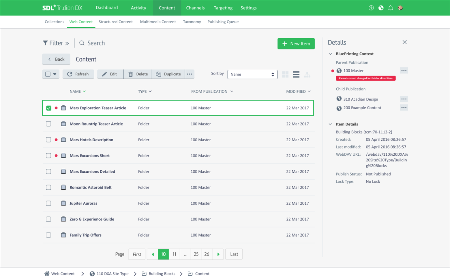
To ease navigation and search, the content manager explorer UI will include the following features:
- The removal of the Ribbon toolbar in favor of a contextual action buttons (dependent on current selection)
- Search at the top any list (search options will be provided in left hand filter panel for better accessibility)
- List filter options will be provided in a left hand panel too (on demand)
- Preview panel with content previews and summary appears on the right (appears when content is selected)
- Path for the current location with horizontal (folders on the same level) and vertical (parent folders) navigation options accessible at the bottom
- Pagination for lists
- Key actions will be available directly in the list (rename/bulk rename etc.)
Navigating Content
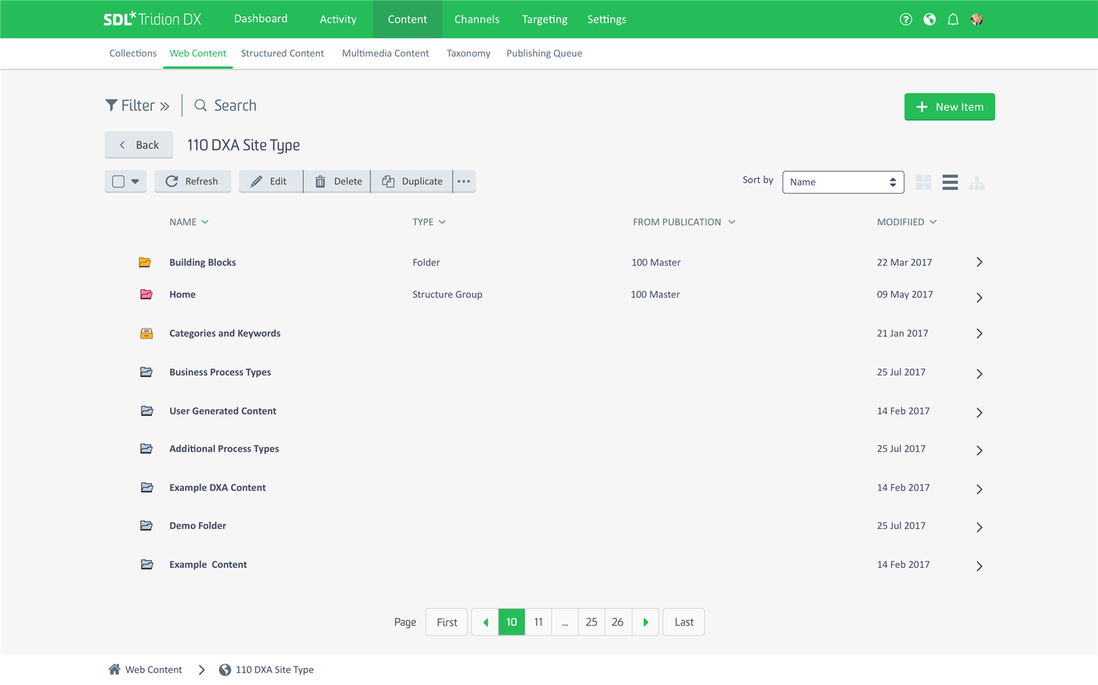
By default we have chosen for a mobile design pattern to navigate the content structure (tapping into a folder and going back to parent level via back button). This is required to ensure the scalability of the UI to mobile form factors and enable touch interaction.
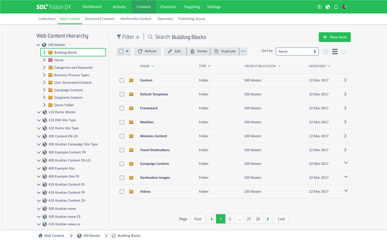
For desktop environments featuring big screens however, we will provide the option to switch to a traditional two-panel setup (tree on left, with list next to it). This empowers implementors that have to browse and switch publications a lot during system setup.
In-line Alerts
The list would also allow for alerts, change indications, or inline updates. The example below shows how an alert could be exposed in-line, notifying the current user that the parent item for a localized item has recently been updated and requires review. Selecting the item will provide more details about the alert in the preview panel on the right.
Content Items
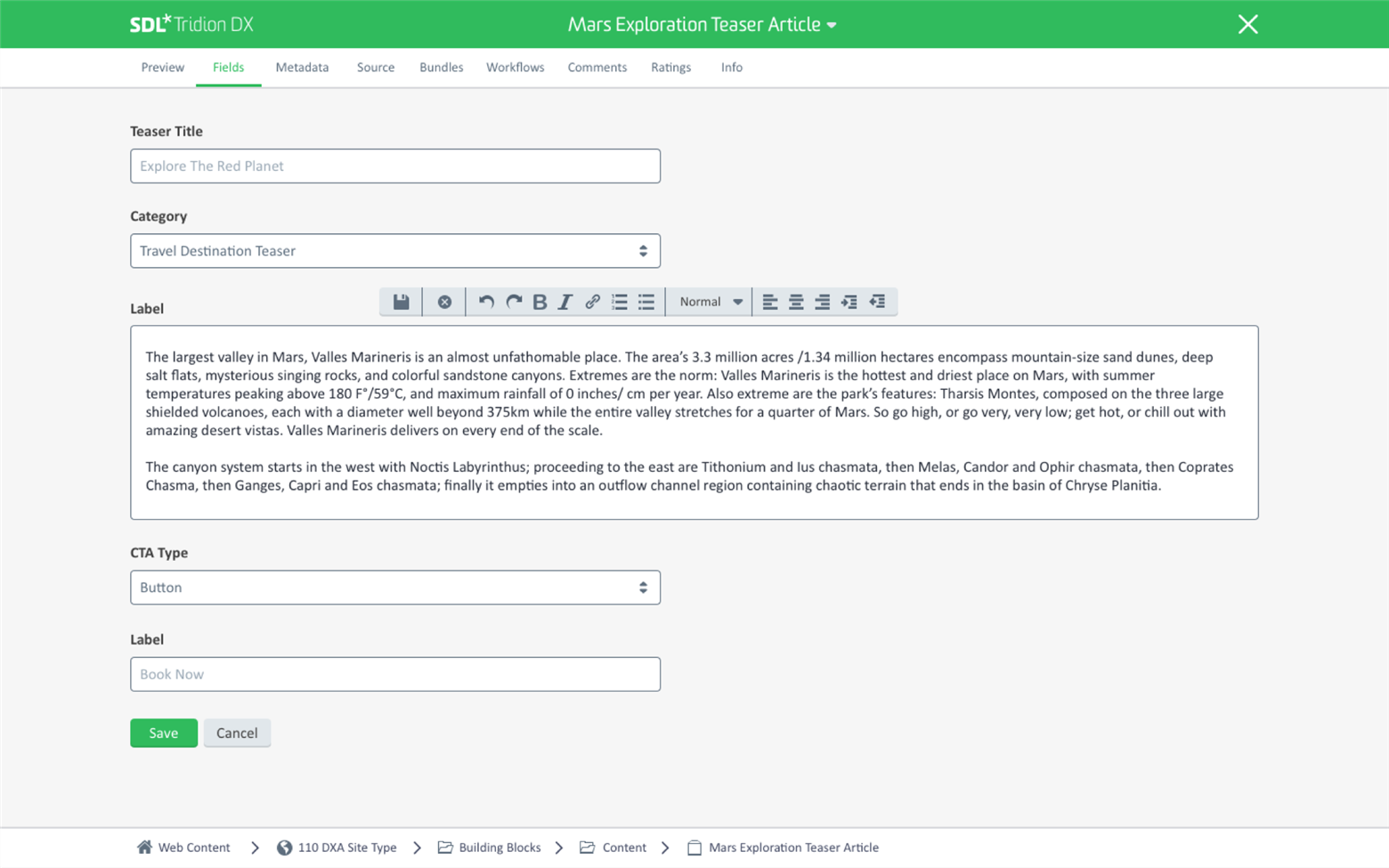
As before, each individual content (e.g. a Page or Component) item will be shown in a separate screen, relying on native browser tabs for multi-document scenarios. Our design goal and challenge for every individual item screen is to radically simplify and improve them, the example below shows a component.
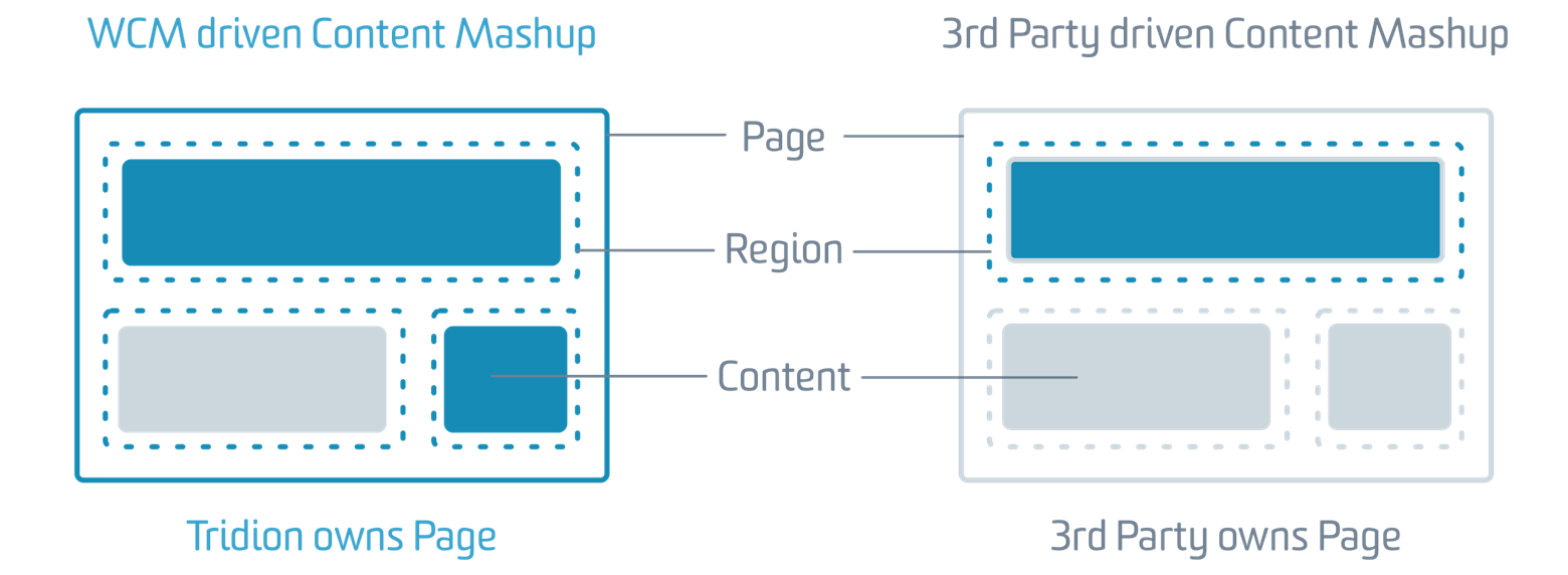
As already described in the recent Tridion DX announcement, Tridion Sites can be run in a variety of “headless” or “Content API” scenarios. In such scenarios, content will be managed in Tridion Sites, but published to a variety of different delivery environments, contexts and mashups.
In this case, Tridion does not manage the web page to which the content is published. This requires some level of “omni-channel preview” to enable editing and previewing several applicable contexts and channels. The example below shows how such preview could be integrated into a typical content component screen, allowing accurate and nearly accurate previews for several publishing contexts.
Form views in Tridion Sites will be radically simplified with clean form design, appropriate sizing of fields and UI controls, and a smarter and more contextual exposure of actions and functionality. We hope this will make the content editing experience using form views much more effective and easier to use.
A design strategy we defined around editing controls (e.g. when editing a rich text field) is to use the same controls for the same field type across form views and in-context editing in Experience Manager. This means the editing experience is consistent regardless of where it’s done. Functionality and options are also shown “on demand” to not “clutter the UI” if not necessary.
Channels & In-context Editing
The “Channels” section in the main navigation lists all destinations you will be able to publish to from Tridion Sites. It contains all kind of content mashups (e.g. if you are publishing web content to an eCommerce or marketing platform), your Tridion Docs publications, and of course it will contain your Tridion Sites. Creating, managing, and localizing sites will be possible via a sites grid/list. Sites are represented as cards or in a list view, containing relevant information (e.g. available languages), status, and actions right there.
From here, users will be able to navigate to a specific site (either on staging or the live site) to see it in context. If users navigate to the staging environment of a site they will be able to preview and edit content in context using the experience manager user interface.
Our design strategy for Experience Manager focuses on improving known issues and shortcoming while radically simplifying the editing experience. The content will have the center stage and Tridion Sites UI and overlays will only be shown if necessary. Regions, drop zones, borders etc. will all be there too – but hidden if possible to keep the users focus on the content as it really looks and feels.
The Ribbon toolbar goes in favor of more embedded, contextual controls. Default tasks, such as adding content, will also be triggered from the region or location on the page where the new content should be added. There, it will reveal options for content types that can be added in the first place, and exposes a content browser to find the actual content after.
Browsing content will use the same navigation screens and principles as discussed earlier in context of “Content Management”, but in context for the specific task. We believe this will make the editing and navigation experience more consistent, seamless and integrated between in-context and out-of-context editing. This general design approach for in-context editing will allow us to expose an “embedded experience manager” together with a region and related content in content mashup scenarios. More about this in a later post.
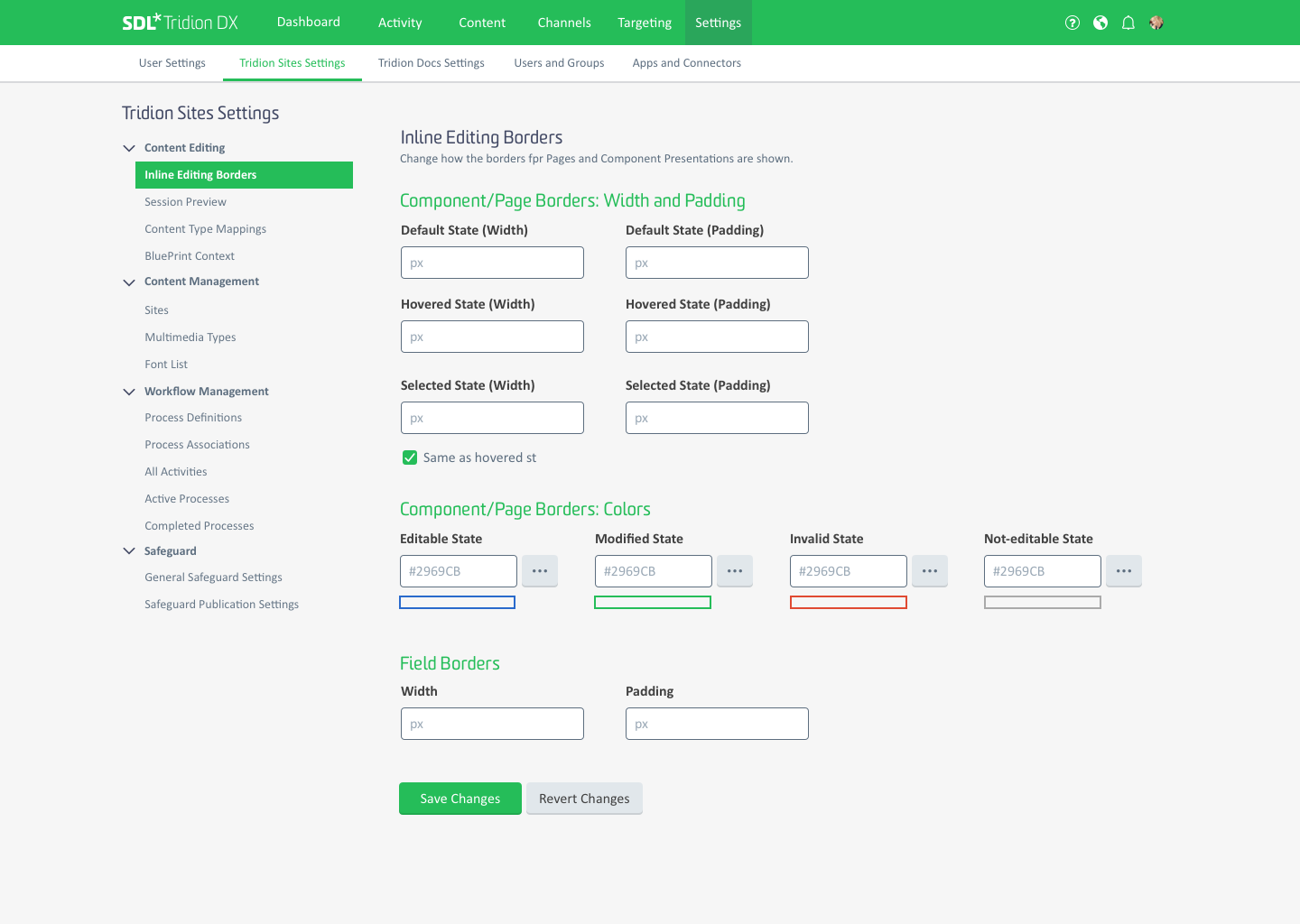
Tridion Settings
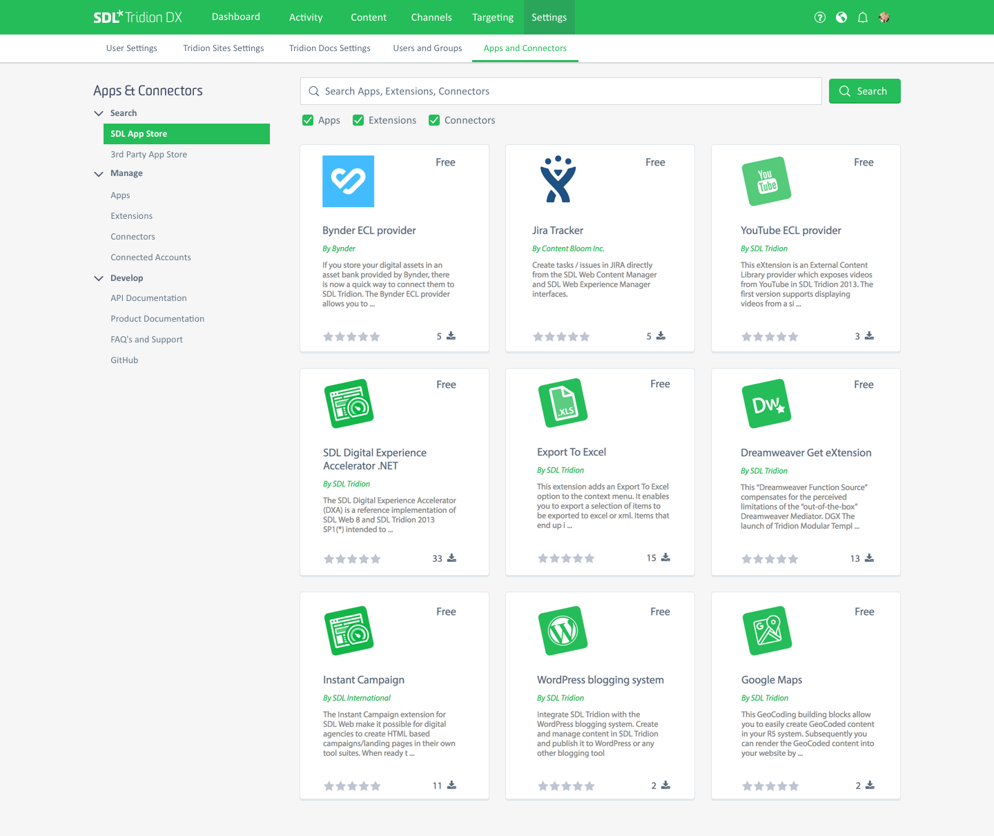
Last topic in this Tridion Sites UI design preview, but nonetheless an important one, is the reorganization and simplification of system settings. Tridion grew over the years and was extended from version by version, so did the possibilities and formats to set up and configure it. The new Tridion UI will have one “Settings” section that is accessible via the main navigation. For business users, it might only contain their personal user settings and preferences. For systems admins, it will provide full access to all settings around Tridion Sites, Tridion Docs, User and Group management, and a section dedicated to Integrations and Connectors.
Extensibility of Tridion Sites is a very important topic for us and I will provide another design update dedicated to that. Our aim is to provide a simple and guided way to browse apps and extensions from different sources and stores (e.g. SDL App Store or Alchemy App Store), install them easily via the UI, or even preselect and approve individual UI extensions on a user by user basis from a centralized location. More on this topic soon!
That summarizes our preview of the broad design concepts and the new Graphene UI for Tridion Sites. The first post focused on the overall design direction and what’s in for business users and content teams. This post highlighted concepts and strategies aiming at our technical expert user community. We at SDL are super excited about this project and I personally hope that through this Blog I was able to share a bit of this excitement with you too.
What’s next?
As development teams are gearing up to lay the foundation for the new UI and bring all API’s in shape and form to start building it, the UX design and product management team is in the middle of validating and testing the above concepts and designs with customers. It’s iterative, so what I described above will change and evolve based on feedback we receive and the things we learn along the way. Do you or your organization want to be part of this process? Reach out and let us know! We are eager to evolve those design concepts in every iteration in real world scenarios. That's the only way to translate a pretty idea into a usable and valuable product!
And finally, we can only learn and evolve if we hear from you and understand you better! So please leave any feedback or questions you might have below this post and continue the conversation there.
SDL’s User Experience Design Team!

 Translate
