
While testing the In-Layout editor I found that white text can be an option as background color does not make it into the editing box:
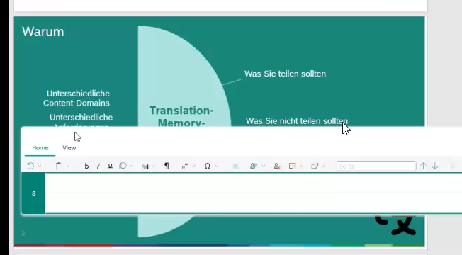
As you can see here, the white text on greenish background gets displayed in the editor overlay as white text on white background that I only could see once I selected the text in the editor overlay.
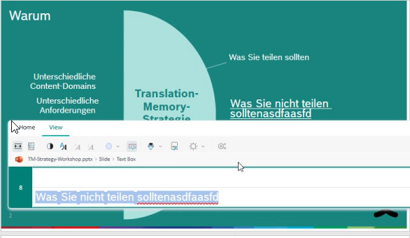
One other thing that can be confusing is text lenght overruns because of the target text being longer:
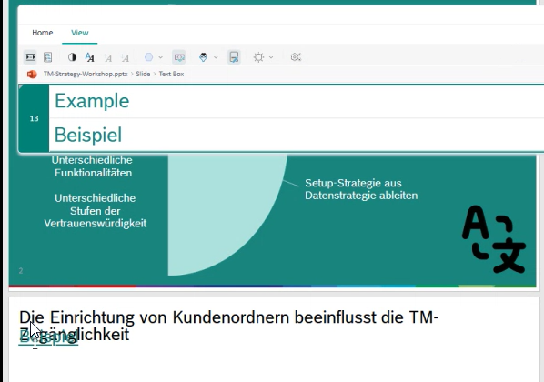
Here the text "Beispiel" gets unreadable because it overlays the text that now takes 2 lines instead of one as in the source document.
If it would be possible to already adjust the layout here via dragging the previewed "Beispiel" further down a little, and therefore enabling the In-Layout Editor to actually influence the layout of the target file slightly, this would increase the usefulness of this way of working dramatically.
Can you please look into how the UX of this editor can get enhanced further?
I could not find a way to mitigate this in the browser.

-

Bernhard Hoell
-
Cancel
-
Vote Up
0
Vote Down
-
-
More
-
Cancel
Comment-

Bernhard Hoell
-
Cancel
-
Vote Up
0
Vote Down
-
-
More
-
Cancel
Children