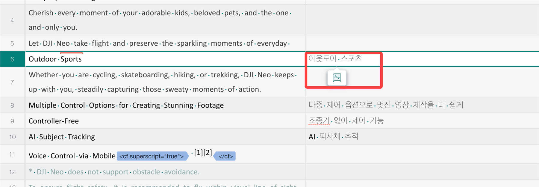
As shown below screenshot example, this small icon pops up automatically during Translation and Review.
When the target segment is long, this icon bothers the readability to see the whole sentence - especially when the linguist does not need this Smart Action function at that moment but wants to focus on linguistic duty.
Please consider adding the Turn On/Off function of this auto popup on Online Editor under Settings so that linguists can turn it off (but still can use the short cut to bring Smart Action back to the interface).
Thanks


 Translate