One of our vendors raised UX improvement suggestions that I wanted to raise here:
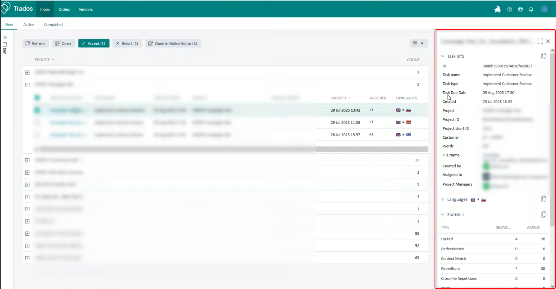
I the Inbox view when screening new tasks, the right hand "infobox" always pops up and may even overlap information like the ammount of new matches, 100% matches etc.
While the same information than you see on the main task list gets displayed in the popup window, it is considered annoying that you need to always go and force-close the window if you want it to dissapear - and upon selecting the next task in the list it will appear again.
The request would be to be able to pin the box to stay minimized / hidden so it does not disrupt the selection of tasks.