
I believe Translation results window is a basic feature everybody uses. I suggest it to be changed in order to be more usable. For instance, a column showing the Translation Memory the Translation Unit belongs to, so you can see at a glance which translation belongs to the best TM.
For example, I work with several Translation Memories of varying quality. I much prefer a 95% match of a good Translation Memory that a 98% match of a worse TM. But as things are now, the translation memory is ONLY listed at the botton of the window for the currently selected segment.
For example, look at this messy layout.
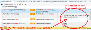
I believe the screenshot is quite explanatory. We have 4 results, with varying degrees of match percentage. They turn out to be EACH of a different Translation Memory., but we don't know which unless we click in seach segment! A clear case where sorting by match percentage is not enough. Here, clearly the translations are very similar, but what if they aren't? What if CAT-171221-1.sdltm is an old legacy TM and I should really focus my attention in newer ones?
The solution is extremely simple. Instead of showing the source Translation Memory in the yellow zone below, put it to the right of the segment, dammit! I don't need the user information at all, but I guess someone could need it. Then allow for some customization of columns!!! Allow me to change the layout to something like:
NUMBER || SEGMENT SOURCE || TARGET SOURCE || TM MEMORY USED... || USER NAME || WHATEVER OTHER INFORMATION I MIGHT NEED...
And other suggestion, this one less vital but handy.
Check this image out.
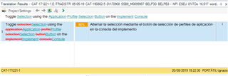
You see a LOT of words crossed out in the source segment, so this must be a terrible match, right? Hey, no, it's an 88% match! So what is happening? It simply happens that many first letters are capitalized differently, but the segment is otherwise identical.
Toggle Selection using the Application Profile Selection Button on the Implement Console
vs.
Toggle selection using the application profile selection button on the implement console
Can anyone imagine how hard it is to discern whether there is a new or really changed word (not capitalzed) among all that bunch of red crossed and blue text?
I guess this is all about productivity. Then change the layout so only the "offending" letter with different capitalization is changed and keep the remaining letters in black colour. That way, we can check in less than a second whether the text is ok instead of having to review the entire segment carefully in order to avoid missing anything!
Something like this!
Toggle Sselection using the Aapplication Pprofile Sselection Bbutton on the Iimplement Cconsole
Don't you think this presentation is much more preferable and easy (and quicker) to check that this nightmare, the one Trados uses?
Toggle Selectionselection using the Applicationapplication Profileprofile Selectionselection Buttonbutton on the Implementimplement Consoleconsole
To prove it, you may try to find the word missing in the two examples below and tell me in which one is easier to find and less prone to errors when working at overload.
- Toggle Selectionselection using the Applicationapplication Profileprofile Selectionselection Button on the Implementimplement Consoleconsole
- Toggle Sselection using the Aapplication Pprofile Sselection Button on the Iimplement Cconsole
We have a clear readability winner, don't we?
It's all about productivity, and I am constantly bombarded with these capitalization issues.
