
The progress bar in the files view is not very helpful when checking which files are lagging behind etc.
The reason is that some information is redundant while other information is missing.
E.g. a green bar covering about two thirds with the number 77% in it tells me three times how far something has progressed. (Color and length of the bar plus the number) However, it does not tell me what it is that is at 77%! So in a column of progress bars, the ones with 5 or 10% can be much further than the ones with 70 or 90%, simply because the 5 or 10% mean "10% signed off" whereas the 70% can mean "70% translated".
I'd like to propose a system that would be more "at a glance":
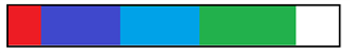
The idea is that each process stage is assigned a color. In this example bar, I picked green for translated, blue for reviewed and purple for signed off. If I understand it right, the Studio logic is that whatever is signed off is also reviewed and whatever is reviewed is also translated.
Red indicates the sum of all rejected segments. I'd skip the percentage number here, because the whole point is to present different stages of progress at once.
Thank you for cosidering this proposal.
Daniel

-

Silvia Cavicchio
-
Cancel
-
Vote Up
0
Vote Down
-
-
More
-
Cancel
Comment-

Silvia Cavicchio
-
Cancel
-
Vote Up
0
Vote Down
-
-
More
-
Cancel
Children