
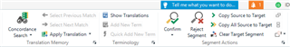
Would it be possible to move the ’Tell me what you want to do’ icon towards the right (near the orange bell) so that it is no longer adjacent to the Confirm button (Editor view)? Perhaps it could simply be shortened to just the light bulb icon with no text (this icon is self-explanatory).
I understand some people might find this feature useful but I don’t. While I simply ignore it when I am in "Translation" mode, it is a hindrance in "Review" mode.
Indeed, when I translate, I mainly use the keyboard shortcuts to go to the next segment (so my cursor is rarely near the lightbulb icon), whereas in Review mode (i.e. when I proofread my work), I tend to use the mouse (more convenient for me), leaving the cursor near the "Confirm" button because most of my translated segments don’t need editing. So, I read my text and click on Confirm without looking because I don’t want to take my eyes off the segment I have just read and risk interrupting my reading the flow and concentration.
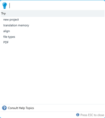
I have lost count of how many times I have clicked on the light bulb by accident, which interrupts my proofreading process. And the other frustrating thing is that I can’t just click on it on the pop-up window to close it - I have to use the keyboard to press ESC.
Thank you for considering this idea.

Top Comments