Under Community Review

Provide a term wrapping view for Term recognition window

(First mentioned here).

As I can see it, synonyms occupy one line each. In plain vanilla, bilingual, multi-synonym termbases (the one most used by translators), this entails the need for long scrolling to see the terms.

A view that would wrap the text and/or allow the line break to be replaced by a (custom?) delimiter like space or comma or pipe would provide a very useful decluttered view. Small test termbase attached.
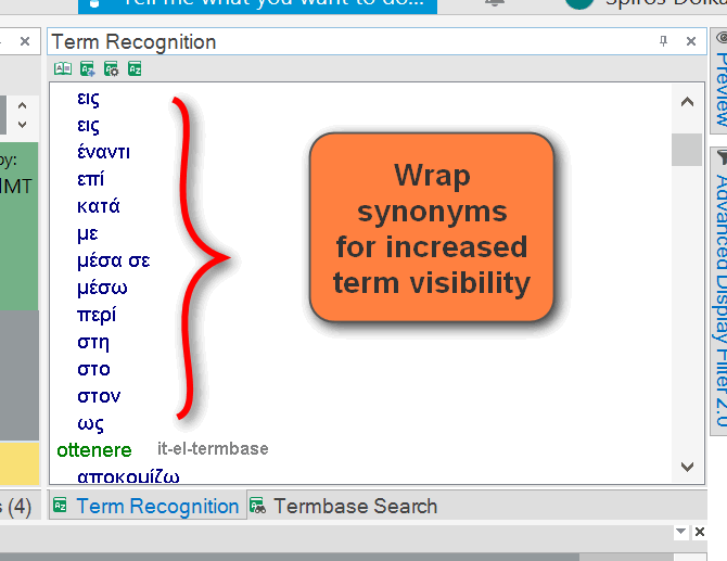
Screenshot of Trados Studio Ideas with a focus on the Term Recognition pane showing a list of terms in a single column. A red squiggly line highlights the need for a feature to wrap synonyms for better visibility.

testtermbase.zip

  • Paul, you are truly amazing! (And this is not the first time).

    There is some room for improvement there. For example, a term may contain a comma (like the name of an organization). To ensure that there is no ambiguity between a delimiter and a term containing a comma, maybe change the stylesheet so that, for example, a background colour style would present the term in a unified manner or some other styling change that would leave no room for ambiguity.

  • Thanks , if you get some support for this we'll take a look at this and may create a plugin to support an alternative view for this scenario (I added the second vote and don't count ;-)). S something like this?

    Screenshot showing Trados Studio Ideas interface with a 'Terms' window open, displaying a list of terms starting with 'per'. An arrow indicates a transition to a different view.