Having recently completed a mobile website development and rollout using SDL Tridion we thought we would share some advice based on our experiences and realization that SDL Tridion is the perfect tool for creating and publishing mobile content.
The aim is to help guide you in creating a mobile suitable version of your website using SDL Tridion taking into account common business factors when doing so.
When building a mobile website using SDL Tridion, the sky is the limit as to what you can do with the software. However there is likely to be a time and cost limit; you may have a small budget and management would like a mobile website to be released as soon as possible.
So what options do you have? Well actually, plenty. The challenge is deciding on the best approach for you.
Option 1: Do nothing!
If you have no budget or time there is always the option to do nothing. Most modern smartphones have pretty decent web browsers that will render your website adequately. Although your website's content may not be as easy to navigate or view on a mobile device, it will, at least, be usable.
There is one major caveat here: Flash! iOS's default browser, Safari, does not support flash and Android will no longer be supporting flash as of Android 4.1 so if your website is built using flash or has a large amount of flash content the 'do nothing' approach won't work and you must provide a non-flash version of your content for mobile users.
Option 2: Use a third party service
Another option in making your website available for mobile is to use a third party service to do the hard work for you. There are a whole raft of services out there that will take your website and transform it into a mobile compatible website. Two notable examples are convertwebsite.com and Mobify.
The main benefit in using one of these services is that the time it takes to bring a new mobile website online can be very short. It may just be a case of entering your website's address into the tool and then pointing your mobile subdomain at the tool. However one major downside to using these types of service is the lack of control over how the content is displayed, these services can also prove to be quite expensive in the longer term compared to some other options.
Option 3: Responsive design, CSS and media queries
Some quick wins can be had by implementing some responsive design features. This is done by presenting the same HTML to desktop and mobile users but altering the CSS that is applied to the HTML. Media queries can be used to add mobile specific styles to format the website and its content for mobile devices. Media queries allow you to apply media (desktop, tablet, phone) specific styles to your website's content depending on the browser and device viewing the site. This is a step up from the "do nothing" approach and can be used to provide a simplified version of the website to a user and can be achieved somewhere between hours and days.
Creating websites that are responsive to the device of the user are gaining popularity. A responsive website can detect the user's device and screen size and will customise the display of the content for the device. Responsive design isn't the silver bullet to solve all your multi-channel device issues. There can be a couple of drawbacks; If your website's layout code is tightly coupled to the design then some challenges are likely. Also, in this approach, we make no adjustments to the website structure and content which remains nearly the same between devices, only the style changes This approach may not provide such an improvement if a heavy amount of content affects your design. In some cases It may be desirable to provide a website experience specifically for mobile devices, for example displaying location information on the mobile homepage but not on the desktop website in which case this approach may not be the most suitable and the next option may work better. This responsive design approach is best utilized when building a new website from scratch. There are some excellent frameworks that can be built upon to improve cross device usability, for example Twitter bootstrap.
Read more about response design and media queries at http://www.alistapart.com/articles/responsive-web-design/.
Option 4: A mobile specific website
The forth option is to create an entirely new website specifically for mobile devices. A piece of client or server side code is used to detect the browser and device requesting a page and redirect to the mobile equivalent of the content on the mobile site. (If you're doing this please remember to add a "View desktop website" link to your mobile footer and set cookies accordingly).
This is the option where the power of SDL Tridion's BluePrint model comes into play. SDL Tridion's BluePrinting model can be used to allow the reuse of content and a website's structure and apply mobile specific templates to the website.
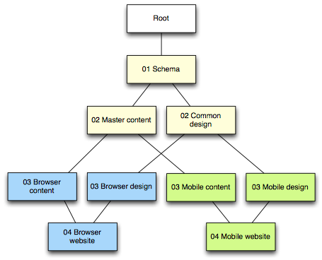
As with all things SDL Tridion, having the correct BluePrint structure sets the foundation for the success of your project and will prevent headaches with any future development. A simple example of an ideal BluePrint structure for a mobile website can be seen in the diagram below.
`
This BluePrint diagram shows how an existing publication's content and structure can be reused in a mobile publication. The look and feel is tailored for mobile devices by localising the templates in the template publication (Mobile design). This approach maintains the URL structure and simplifies redirecting from desktop to mobile websites as a result of visitors coming from external referers.
Mobile templating
There are a few options for the mobile templating itself, the most time consuming being the development of your own HTML framework from scratch. Doing this is very time consuming but will give you complete control over the UI elements.
Another option is to use an existing mobile framework and customise it for your needs.There are some mobile UI frameworks that are definitely worth a look and will significantly cut development time, a few worth mentioning are jQuery mobile, Sencha Touch and, though not mobile specific, Twitter bootstrap can work really well for mobile.
Another interesting service that can be used for mobile templating is NetBiscuits. The NetBiscuits service will take your mobile website's content and transform it into a format suitable for the device. This is done by "marking up" your mobile content with NetBiscuits Markup Language. More information about the NetBiscuits service and how it integrates with Tridion at http://sdltridionworld.com/articles/sdltridion2011/mobileTridion2011Netbiscuits.aspx
Testing tools
During the development of your website, and subsequently during authoring, you'll need to test and preview your work. Using a mobile device for testing can be tricky especially if you're on a restricted internal network. Luckily there are some other options to allow you to test your mobile site via your desktop computer.
Google Chrome
The simplest option for testing your mobile templates and pages is by using Google Chrome. Chrome is HTML5 and CSS3 compatible like most mobile web browsers and will give you a very good idea for how your website will be presented on mobile devices. You won't be able to test some things, for example a device's native UI, but you will be able to get a good feel for your mobile website.
Chromes Window Resizer tool will allow you to accurately resize your browser to the dimensions appropriate for the mobile device you're testing for.
SDL Tridion's preview functionality
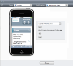
Tridion 2011 has its own mobile preview functionality which can be plugged into your own custom layouts or the NetBiscuits service to display a preview of your pages in a variety of different smartphones and devices.
This can be used during development or by content authors to preview how their new content will display before publishing. A screenshot of the mobile preview tool can be seen below.
Device emulators
There are a few mobile device emulators that can be used to give you a very accurate representation of how your templates will work on mobile devices.
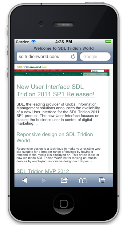
For iPhone testing there is the iOS emulator which is unfortunately only available for Apple Macs and is packaged with XCode.
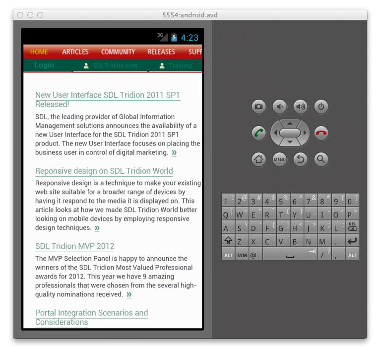
The Android SDK has an Android emulator that can be used for Android testing. A how-to for the Android emulator can be found at http://ebeginner.blogspot.co.uk/2010/03/setup-android-emulator.html
Hopefully this article has helped to guide you through some of the options available to you when developing mobile websites using SDL Tridion. If you have any feedback or comments on anything covered here please see the SDL Tridion forum.

 Translate


