Under Community Review

Project Files - Group files under the same target language

I think the Files tab in a Project could benefit from being grouped together within their languages.

Currently, we see something like so:
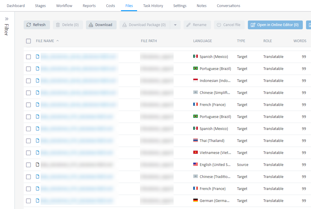
Screenshot of Trados Enterprise Files tab showing a list of files with checkboxes. Files are not grouped by language, making bulk actions for specific languages cumbersome.

If I wanted to select all files for all languages, I know I can check off the very top box. If I wanted to select files for only one specific language, I know I can use the filter.

However, there may be some situations where I need to download files from certain languages after a certain workflow stage, but not all the target languages. For example in the screenshot above, if I need the files for Spanish (Mexico), Portuguese (Brazil), and French (France), I would need to click 6 individual files before I can click Download. The number of clicks can grow exponentially if there are more languages and more files.

But if the files were grouped under the same language, I could theoretically just click 3 times, once for each of the target languages, and then Download.

I imagine people would still want to be able to select individual files, so I'm envisioning a UI where the files are displayed in more of a tree view, with languages as top-level checkboxes and individual files having their own checkboxes under that level.

  • Hi Ian,

    Thanks for your response. I would say in general that would work for projects where we can download all the completed files of those languages, but there are also situations with quick turnarounds where we need to process as files are ready which may require more clicking.

    Not to deviate but the design is also similar on the Task History page and I've found that this tab can also be difficult to navigate when you multiply a large number of languages with large numbers of files and longer workflows. In this tab, there's no option to filter by files either and you really have to sift through the rows.

    I understand that the filters are a big part of TE and maybe it's personal preference but I think the UI/UX on this tab and the Task History tab could benefit by displaying something more useful/readable on the default screens.

    Best,
    Terence

  • Hi Terence,

    For the scenario you describe here, could you not apply a filter for all of the languages you want to download and then select all files using the checkbox at the top of the table?

    I understand this isn't the optimal approach you suggest that would require 3 clicks but it should still offer a better and more scalable experience than selecting files individually from the full list.

    Cheers,

    Ian