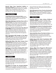
I'm adapting a previous style library and I have some strange things happening. The entries were done in a wider column, with the header [hlt_hd] taking one line and the text [hltp0] starting on the second line. I managed to adjust it for the new column width, but there are some problems.
1. When the header is on one line, the space before the text disappears. On the PDF, first column, see the first entry under "Water Pollution" and the first one under "State News."
2. In column 2, the 3rd entry under "Other News" shows an extra problem: if the word is long (Northern), it will go into the margin.
3. The baselines of the headers and the text do not match up. Is that because the point size and extra lead are not the same?
4. The text used to justify, but it does not now. The header was set rr and I changed that to justify, but the text still does not justify.
The PDF page and screenshots of the item formats & macros are attached. Please let me know if you need to see more.
Thanks!

 Translate
