Hi Everyone,
We had a lot of great ideas and feedback emerging from our previous post: Translation Memories Search. We are about to start a new initiative to review and optimise the Dashboard in SDL Managed Translation. We would therefore like to invite our existing customer base to share their feedback and suggestions on the current Dashboard as that will provide valuable insight when working on designs for the next version of this feature.
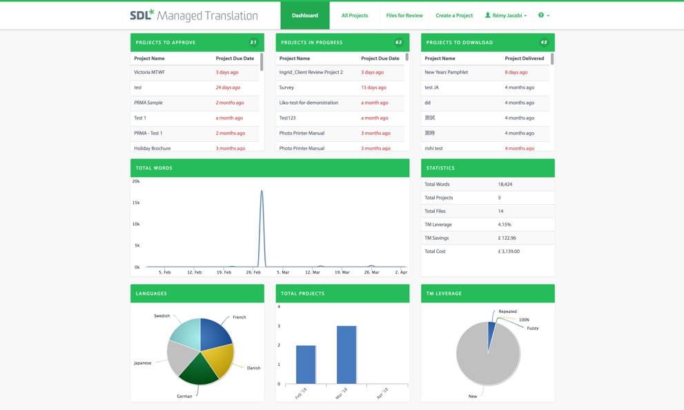
In general, a dashboard provides you with a global view of recent activities, as well as a visual data representation of your account. In your SDL Managed Translation dashboard, the first 3 blocks represent a simplified list of the recent projects that have been submitted (Projects to approve - Projects in progress - Projects to download). The next 5 blocks provide a visual summary of your translation projects. Through them, you can analyse how your projects are being translated and which languages you’re investing in the most. These are visualised as graphs and charts. In this post, we would like to better understand your dashboard experience.
The points below are intended to give you an idea of the feedback we’re looking for but don’t feel you have to be constrained to these particular areas:
- How do you interact with the current Dashboard? How often?
- What information contained in the Dashboard is considered most useful?
- Can that information be presented in a more accessible way?
- Do we include anything in the Dashboard that isn’t of interest to you?
- What information is missing from the Dashboard?
- What features are missing from the Dashboard?
- Any other enhancements you can suggest that would improve the current Dashboard in SDL Managed Translation?
With your input we will be able to come up with a better dashboard experience. Thanks again for taking part in the design process :)
Generated Image Alt-Text
[edited by: RWS Community AI at 5:53 AM (GMT 0) on 14 Nov 2024]

Rémy Jacobi - User Experience Designer at SDL

 Translate
