
Currently, the Translation Results window displays the warning “Different target in translation memory” on top of the result details. Because of this, I have to click the Information icon to view the result details, which is quite inconvenient.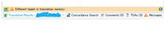
I would like to be able to see both the warning and the result details at a glance, without clicking anything.
It could be helpful if the warning and the result details were displayed either vertically (one above the other) or side by side.
Thank you for considering this suggestion.

-

Alessia Nasini
-
Cancel
-
Vote Up
0
Vote Down
-
-
More
-
Cancel
Comment-

Alessia Nasini
-
Cancel
-
Vote Up
0
Vote Down
-
-
More
-
Cancel
Children