Hi!
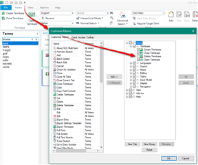
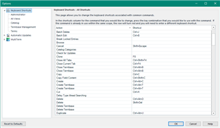
Not so much a question as a suggestion for future versions. It would be great to have the "Delete termbase" button further away from the other options. I know there is still a confirmation window that pops up before you actually delete the termbase, but it's a real risk. Especially at the end of the day, when you want to close it and accidentally the mouse moves a tiny bit further down... :)

 Translate


