


Hello all,
I am realizing with time that I waste so much time and energy just because a poor window working layout set-up..
I imagine there is something that I am missing, but do not seem to locate it.
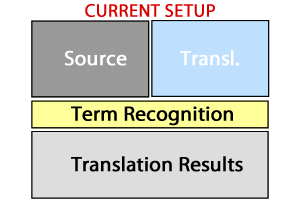
One thing I hate in my current lay-out setup is that the Term Recognition window is laid-out across below the Source and Translation window, but sin the TR is shown column-wise, I only see a few terms, forcing me to scroll down, which is so annoying, specially since 90% of the TR space is dead (to the right of the results column).
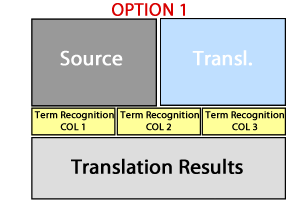
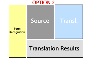
Since it is easier for me to explain what I need graphically, I have quickly re-created this 3 set-ups.
I was wondering if my current set-up, was posible to be "converted" to Option 1 (dividing the TR window into multiple columns) or ideally to me, Option 2 (pinned to the left of main text window, not on top of editor. projects, etc space, just "stealing" some of the space of the others, making them narrower)
Thanks!
Generated Image Alt-Text
[edited by: Trados AI at 4:17 PM (GMT 0) on 28 Feb 2024]


