Giant icons in SDL Trados Studio 2021

Dear all,

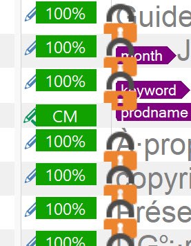
Am I the only one who experiences giant segment status icons in Studio 2021? Everything else displays OK (i.e. like in previous versions).

I have patiently waited for a fix since I can revert to Studio 2019, but nothing changed despite several updates.

I do own a high DPI laptop that Studio notoriously struggles to supports. But since these icons render correctly in Studio 2019 and 2017, Studio 2021 should be able to do the same.
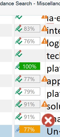
In version SR1 16.1.6.4276 In version SR1 16.1.8.4404
In version SR1 16.1.6.4276 In latest version SR1 16.1.8.4404

Philippe

  • Hello @

    I have only seen such large icon issues reported once or twice before.

    Ensuring both Studio & Windows (including all drivers) are on the latest stand has helped.

    Also please ensure the Windows scaling is correctly set to 100% should also help.

    We also offer the following app

    https://appstore.sdl.com/language/app/change-scaling-behaviour/790/

    and other recommendations that could help here

    https://gateway.sdl.com/apex/communityknowledge?articleName=000001872

    Lydia Simplicio | RWS Group

    _______
    Design your own training!

    You've done the courses and still need to go a little further, or still not clear? 
    Tell us what you need in our Community Solutions Hub

  • I have only seen such large icon issues reported once or twice before.

    UPDATE 02-Aug-2021: 
    The below-stated information about non-changing font size seems to be incorrect. If I only restart Trados (precisely what I did) after switching between different scaling levels, then true, the icons change in size, but not the text. However, the text size changes after reboot. 

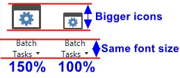
    It is not random. It always happens with scaling 150% in Windows. With 100% scaling Trados turns unusable. This disaster occurred after an update at the end of April, this one I suppose: Cumulative Update 5 for SDL Trados Studio 2021 SR1 (Build 16.1.5.4270, released on 27 April 2021). It was OK before that update. For some reason, SDL developers decided to enlarge icons but not fonts. No matter what scaling I choose, 100% or 150%, the font size remains the same. On the other hand, icons grow accordingly when I switch from 100% to 150%.

    Screenshot showing Trados Studio interface with larger icons at 150% scaling and smaller icons at 100% scaling, but the font size remains the same for 'Batch Tasks'.
    You* (SDL at that time) changed something in CU5. Why can't you undo that mocking "improvement"?
    *If you personally are not an SDL employee, then it would be a good idea to have a marker to somehow distinguish SDL/RWS staff and Trados enthusiasts.
    There is a great gap between 

    I have only seen such large icon issues reported once or twice before.

    and 

    We definitely have analysed these problems, certainly a lot more than you would know, and we will continue to work on improving

    The first statement positions the issue as if it was a random and unimportant glitch that can be easily ignored. The second statement is completely different.

    emoji


    Generated Image Alt-Text
    [edited by: Trados AI at 4:45 AM (GMT 0) on 29 Feb 2024]
  • these icons render correctly in Studio 2019 and 2017

    They rendered correctly in Studio 2021 either until CU5. I remember a topic on the 26th of April (roughly) about the issue of microscopic fonts with high DPI monitors and 100% scaling. Next day after that discussion an update (CU5) was released to "fix" the issue. What you see now is the result of that "fix".

  • They rendered correctly in Studio 2021 either until CU5

    Thanks for the clarification. Yes, I had the impression that Studio 2021 displayed these icons perfectly well at some time, but I could not be 100% sure.

    I am not satisfied with Steven’s answer. In the past, I already fiddled a lot with the scaling parameters in Windows, the add-on, Studio’s font sizes, even hacks with manifest files… just to make Studio 2019 and Passolo usable. And even though it is still not perfect – for example, the Termbase Viewer is unusable – the panels and features I need in my everyday work render OK in Studio 2019… and rendered OK in Studio 2021. I am not going to break everything just because of one single buggy icon, that, unfortunately, is shown right in the middle of the editor window. Angry

    It seems that RWS and Steven never bothered to analyze seriously these scaling issues. To a complex and annoying issue, they always provide the same standards answers – recommendations that mostly do not work, see the Termbase discussion:

    • the slightest change in the Windows scaling parameters will affect hundreds of applications. It is not true that changing a global parameter in Window will magically fix a buggy icon in a software without serious side effects elsewhere.
    • the add-on may fix some scaling-related issues in Studio, but will break others. The menu bar may become oversized, some important dialog boxes unusable – I went through this already. Test it and you will see!

    So please RWS, do regression testing and render these icons like before.

  • What is ridiculous is the fact that the QA Warning icon is OK, but the QA Error is not!

    Knowing that, it becomes so obvious that this is a bug!

  • It seems that RWS and Steven never bothered to analyze seriously these scaling issues. To a complex and annoying issue, they always provide the same standards answers – recommendations that mostly do not work, see the Termbase discussion:

    On some levels an incredibly ignorant reply, but I can see where you're coming from and you don't have any insight into what the development team is doing.  I too would be really irritated by behaviour like this in a tool I use every day.

    Steve and others helping out in here can only suggest what may help based on what they have seen.  They are not developers.  Your own investigations have already added a level of knowledge that could well be helpful to others as well.

    The development team are working to improve the situation to the best of their ability.  But it's a complex issue that is a work in progress.  Each release gets a bit further and inevitably we break things from time to time that may affect some users (fortunately not too many have this problem you are facing).  Studio is built at the moment using two technologies: WinForms and WPF.  WPF is more open to supporting our ability to display better on all types of screens as it allows us to work with the Microsoft interfaces in a more controlled way.  But since we have been effectively rewriting all the code to change from Winforms the move to WPF is not complete.

    The two main challenges that that we are facing that prevent us from more easily switching completely in one big release to WPF are dependencies on 3rd party controls which require careful and significant effort to change.  This means that some screens, or parts of them are still in Winforms. They are just wrapped in a WPF shell.

    We definitely have analysed these problems, certainly a lot more than you would know, and we will continue to work on improving things as we go forward.  I'll share your comments with the development team and see whether they can suggest anything you have not tried already, but hopefully as we go forward these problems will become a thing of the past anyway.

    Paul Filkin | RWS Group

    ________________________
    Design your own training!

    You've done the courses and still need to go a little further, or still not clear? 
    Tell us what you need in our Community Solutions Hub

  • Paul,

    First you cannot call me ignorant: I spent more years developing software than you did… and on top of that, in the UI and debugging complex issues. But never mind, you have been so helpful in the past…

    I am unhappy because for every issue that is remotely connected to scaling, the same list of steps is provided. Your answer shows that you care, but Steve’s answer never suggested that you are willing to work on this issue. It may even be a copy/paste from previous answers. He did not even acknowledge that there may be a bug with the icon! All he said was to install an add-on and try fiddling with global computer settings – which will not make things better overall, I can assure you. His answer may be appropriate in some general cases or when all Studio UI has display issues, but not for such a local issue.

    Now, I am aware that the scaling issues are a nightmare. We never asked for a general solution. In fact, as you can read in other threads, most of the time we give up and cope with it as long as there is a workaround. But here is just one icon – one! – that suddenly gets in the way, covering characters in the target column. Since there is "a lot more that I would know", I challenge you to explain why the Warning icon is shown with the correct size (my first screen capture) and the Error icon is not. I am very curious to understand the logic behind that.

    Meanwhile, I will continue using 2019 but will have to escalate to the PMs/resource coordinators in case this particular issue is not taken seriously. The screen captures above are taken from projects I deliver to… RWS and they will not be happy if I tell them that the quality may suffer because I had to disable the QA alerts.

  • … I didn’t call you ignorant. But your reply was… especially for such an experienced developer. To think we wouldn’t already do the very things you mentioned.

    Paul Filkin | RWS Group

    ________________________
    Design your own training!

    You've done the courses and still need to go a little further, or still not clear? 
    Tell us what you need in our Community Solutions Hub

  • Hello, as a fellow developer I want to provide you some insight into the challenges we had with HiDPI. Firstly, we have the following requirements as input: we need to support various DPI & scaling ranges on multiple versions of Windows (7, 8, 8.1, and a multitude of sub versions of 10) for different monitor sizes (200% scaling on a narrow screen is not the same on a wide screen), multiple monitors with different DPI and different technologies (Trados uses WPF, WinForms and raw C++ for exactly the area you mentioned in the screenshot)

    When we started working on this change we had to decide between the newest algorithms that Windows was automatically using or do it ourselves. If we were to allow MS to render Trados, what it would have done is render it at low resolution and upscale it. Their latest anti-aliasing algorithms are great, but they are only available on the latest WIndows 10 updates (v 1903). If we were to fully let Windows handle the scaling we would get blurry icons on some older version of Windows 10.

    As a developer and user of paid software I do understand your disappointment, yet in spite of these current setbacks we still think it’s better for us to handle all these rescalling than to be at the mercy of a new Windows update.

    Regarding your mention that other software works perfectly, an example would be Microsoft Teams that has issues on different versions of Windows.

    For more info please see the following link related to Windows scaling issues for high-DPI devices.

    You can imagine the effort needed to fully test all these combinations. It would be of great help for us if you tell your OS version, Per Monitor scaling and Resolution, which one of these monitors is your primary and finally on which of these monitors you startup Trados.

  • Hi ,

    I am sorry to jump into your convo with Philippe Noth, but this issue is #1 for me either. I appreciate all your effort and all the things you do for us users, but could you please add your/RWS recommendation as to which monitor works best with Trados Studio? Just like other system requirements (RAM, free disc space, SSD, whatever else you list there) on your System Requirements page... From what I can see on that page at the moment: "As a minimum requirement... blah-blah-blah... a screen resolution of 1024x768", my recommended [by Windows] screen resolution is 1920x1080, which is higher than the above-mentioned minimum. But it still doesn't perform well with 100% scaling. Ok, I admit it was my mistake to choose this type of monitor for Trados, forget it. Now that I am ready to buy another monitor that fits Trados better, can you advise more specific screen requirements so that I could go to the store with this information and say: "Hi guys, I want a specific monitor with these particular screen requirements recommended by RWS for Trados". Is it possible [to give a specific recommendation on this]?