Hello Paul
So I have completed my first small job with the tool. As I expected from the demo, it was perhaps the most efficient way of doing the job there is, IMO, so overall positive and very welcome, as I said to you. Now issues:
1. A SRT import flaw? – in my customer-supplied SRT, line breaks were not recognized by Trados, not displayed in preview (or perhaps as spaces), but then re-appear after export (so most 2-line subs became 3line subs); corrected manually after export
What follows are improvement ideas within the current intention. (What would go beyond it, ie require building waveform to tweak sub times etc, I will not discuss here.)
2. Visual focus - is the big one. What I am really interested in when translating a sub is CPS and characters on current line. So what I need to see clearly and quickly are those two numbers (or three numbers, chars for each line of current sub, plus CPS), perhaps huuuuge! A slight rethink of the layout needed, maybe. There are other possibilities such as countdown (chars remaining on line, chars remaining for the whole sub.)
3. Option to remove columns completely (words, WPS not needed)
4. Character count for both lines of a sub – this is a must. Number of chars for the two lines combined of very limited use
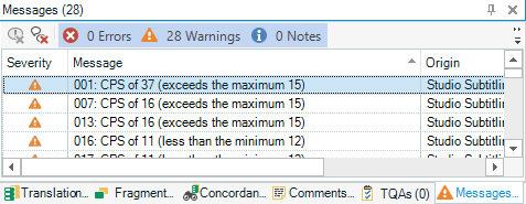
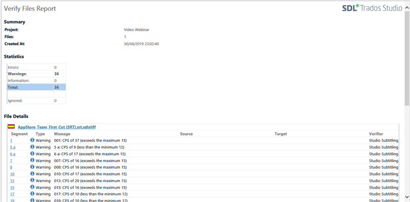
5. Need to see chars on each line and warning of exceeding them before confirming segment, not only after; with CPS, again, ideally see warning of exceeding it before confirming segment (not a tiny little number in the other corner of screen in a column of dozens of numbers of the same size).
6. Ideally the possibility to set one max CPS level for warning (ie 17), another for error (ie 21)
7. A play/pause keyboard shortcut! (Alt-space?)
8. Perhaps help with line breaking, but his is optional. Ideal behaviour would be: always add one (and make sure only one) space after last word before line break, but do not count it into CPS or chars. (The reason is we often try out different ways of breaking a sub into lines to make it look best.)
9. Windows layout - somehow I expect this to be a sore point. The Subtitling app only highlights the need for the whole Trados to have a simple way of switching different windows layouts for different type of tasks.
Sorry for writing in a sort of shorthand, I will explain better if needed.
Overall, I love the simplicity, and perhaps would take it even further.
Pavel

 Translate

