
Hi, relatively new user here. I searched as best I could but couldn't find any information on this in the help files or forum, so if it has been answered before, please point me in the right direction.
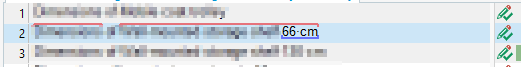
By default, term matches get a pale red "underline" over the text to indicate a match. But this line is so thin and pale that it's causing me eye strain.
Is there any way I can make this line thicker or make it a more vivid color? Or even to space it out so isn't nestled into the top of my text? (my source text is always Japanese, and a significant amount of the characters extend onto it, almost camouflaging the line.)
(Things I've tried: Increasing the source text font size with Font Adaptation doesn't increase the thickness of the line, so unfortunately it doesn't really help. I also tried fiddling with all the color options I could find like changing the background of the row to a contrasting color, but that didn't really help either. The line is just so thin and pale it doesn't stand out enough against anything I tried, even stark white.)
Thank you in advance for your help!