Trados Studio Manager View - Feedback Opportunity

Your opinion matters!

Join our development team on a one to one interview and tell us what the experience of working with projects and files in Trados Studio is really like.

Why?

In recent years Trados Studio has undergone many changes as our product teams endeavour to ensure that it's a tool that can meet the needs of all of our users.  This work never stops and more recently you may have noticed that we have introduced a new feature, still in Beta, that offers a combined view for projects and files:
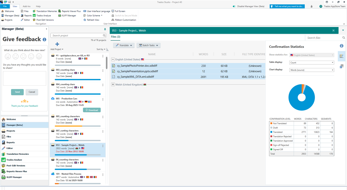
Trados Studio interface showing the Manager View (Beta) with a 'Give feedback' window open on the left and a project with files listed in the main area. Confirmation statistics pie chart on the right.

If you haven't seen it yet, and if you use Trados Studio 2022, then you can enable it by using this slider you'll see at the top of Trados Studio:

Close-up of Trados Studio top menu with an arrow pointing to the 'Enable Manager View (Beta)' slider.

Once enabled you'll see a view similar to the one above and you'll have an opportunity to provide feedback using the "Give Feedback" window in the navigation pane on the left.

We have been receiving some feedback, but we'd really like to try and get some more detailed feedback on how this could be improved based on our users experience in working with it, and also in working with the standard Projects and Files views that have been available in Trados Studio since the original 2009 version.

OPPORTUNITY FOR ONE TO ONE INTERVIEWS CLOSED FOR THIS YEAR.  WE MAY RUN THIS AGAIN AFTER WE HAVE IMPLEMENTED THE VALUABLE FEEDBACK PROVIDED BY THOSE OF YOU WHO WERE KIND ENOUGH TO VOLUNTEER YOUR TIME AND SHARE YOUR EXPERIENCE.

FEEL FREE TO CONTINUE TO SHARE ANY FEEDBACK YOU HAVE IN THIS THREAD.

THANK YOU.


Generated Image Alt-Text
[edited by: Trados AI at 8:59 AM (GMT 0) on 29 Feb 2024]
emoji

Paul Filkin | RWS Group

________________________
Design your own training!

You've done the courses and still need to go a little further, or still not clear? 
Tell us what you need in our Community Solutions Hub

Parents
  • I can't figure out the use of the list of source files. The only actions available for them are the batch tasks, and in many cases the results of these are the same as when I perform them on the target files.

    And a question about the search function: It seems to be intended for finding projects with the search word contained in the project name. Is that correct?

    Another minor matter: It is impossible to shrink the size of the rightmost column. So if I shrink all the others, I am left with a very broad last column, which also means that if I shrink the size of the Trados window, that last column will be cut off. No big matter but slightly irritating.

    Finally: The information icon for Give feedback does not work.

    Otherwise, a nice touch-up (particularly the statistics views) even if I must admit that I so far haven't found much use for it.

    emoji
  •  

    I can't figure out the use of the list of source files.

    You now have one view for projects AND files.  Previously you had two views, one for projects and one for files.  You can open the files from here, you can see all the files for each target language (useful in a multilingual project) and you can also see the source language files (useful if you want to check the source files themselves).  Maybe more reasons too... this was just off the top of my head.

    in many cases the results of these are the same as when I perform them on the target files.

    Thank goodness for that!  If you'd said the results were different then we would have a problem!

    And a question about the search function: It seems to be intended for finding projects with the search word contained in the project name. Is that correct?

    Correct.

    Another minor matter: It is impossible to shrink the size of the rightmost column. So if I shrink all the others, I am left with a very broad last column, which also means that if I shrink the size of the Trados window, that last column will be cut off. No big matter but slightly irritating.

    Yes... I think this came up in the meetings we have been having.  Quite a lot of relevant feedback around the way these views are handled so expect to see many more improvements as go through the Beta programme for this.

    Finally: The information icon for Give feedback does not work.

    What happens and which icon are you referring to?

    Otherwise, a nice touch-up (particularly the statistics views) even if I must admit that I so far haven't found much use for it.

    Thanks Mats... I'm really surprised the three or four users who were vehemently complaining about statistics in the current production version have not contributed to this exercise at all.  It's the perfect opportunity to make clear why there needs to be a change and influence the direction of the software.  I guess complaining in the forums instead has some other value for some :-)

    Paul Filkin | RWS Group

    ________________________
    Design your own training!

    You've done the courses and still need to go a little further, or still not clear? 
    Tell us what you need in our Community Solutions Hub

    emoji
  • Hi   and  

    I also noticed that when you adjust the column size, it does this only for the first target language, but the columns of the next target language below stay the same, which looks quite odd:
    Screenshot of Trados Studio showing two target languages, French (Switzerland) and German (Switzerland), with mismatched column sizes. The 'WORDS' and 'SIZE' columns for French are wider than those for German.

    emoji


    Generated Image Alt-Text
    [edited by: Trados AI at 9:00 AM (GMT 0) on 29 Feb 2024]
  • Thanks for these swift and informative replies! The information icon I mean is the "i" immediately to the right of the words "Give feedback". Normally, such an icon will provide extra information when clicked. This one does nothing at all, which means it could as well be removed.

    emoji
  • Did you read my reply about this with the screenshot?
    The icon shows a tooltip when you hover over it.

    emoji
Reply Children