Please bring back the good old Workbench view in translation results window

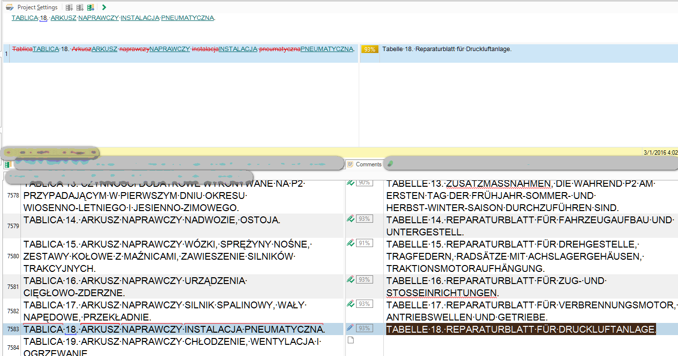
This is a 89% match seen in Studio:

Same match viewed in Workbench:

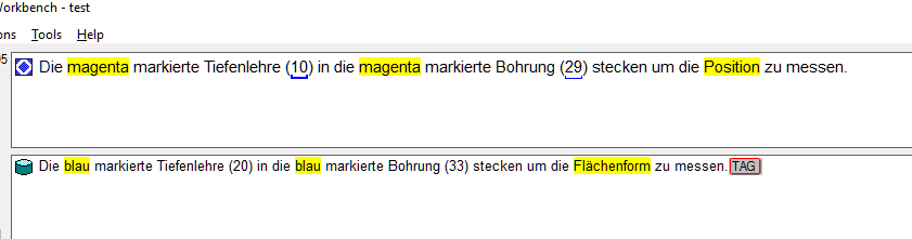
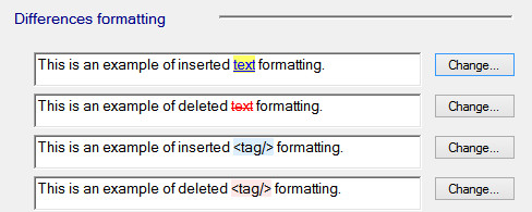
How much clearer and easier to read...

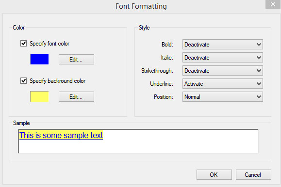
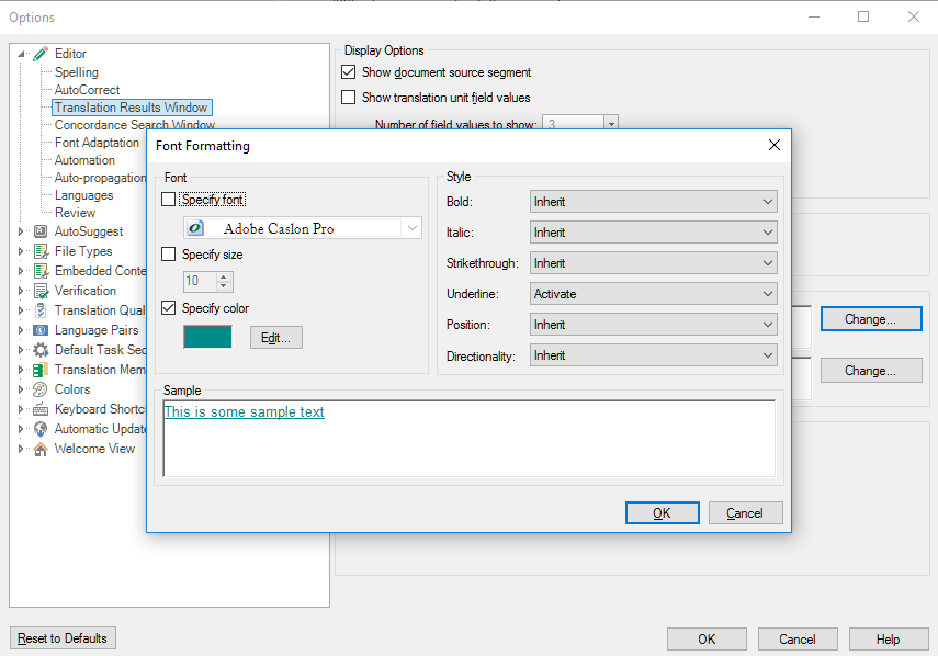
It would even be sufficient to add "background colour" here:

Why don't you simply return to what has been perfect in the past and BEAT ANY OTHER COMPETITOR with it? This has been one of the most voted ideas on your Ideas site...

_________________________________________________________

When asking for help here, please be as accurate as possible. Please always remember to give the exact version of product used and all possible error messages received. The better you describe your problem, the better help you will get.

Want to learn more about Trados Studio? Visit the Community Hub. Have a good idea to make Trados Studio better? Publish it here.

Parents
  • Gets my vote Jerzy... I'd like to see this option too.  maybe similar to the way it's been done in some of the Apps like this:

    Then you have these options for them:

    I'd like this.

    Paul

    Paul Filkin | RWS Group

    ________________________
    Design your own training!

    You've done the courses and still need to go a little further, or still not clear? 
    Tell us what you need in our Community Solutions Hub

  • Here is even a better example, why the current view is fully unusable.

    The only difference between the previous match and the current one is the capitalization, but I bet if you wouldn't know that, it would take you not just a glance to figure that out. A yellow background would be much more legible here. But just look and convince yourself:

    This is not something to keep on the backlog, because it drops the productivity of all of us dramatically - and this has been heavily voted on ideas. Many people will even not know how the difference is - all who never used Workbench will notice the difference only if you show it to them. But when you show this, I beg they will love the change.

    So please make it possible to chose already in the upcoming Studio 2017. This is my second important vote after merging over paragraph breaks.

    _________________________________________________________

    When asking for help here, please be as accurate as possible. Please always remember to give the exact version of product used and all possible error messages received. The better you describe your problem, the better help you will get.

    Want to learn more about Trados Studio? Visit the Community Hub. Have a good idea to make Trados Studio better? Publish it here.

Reply
  • Here is even a better example, why the current view is fully unusable.

    The only difference between the previous match and the current one is the capitalization, but I bet if you wouldn't know that, it would take you not just a glance to figure that out. A yellow background would be much more legible here. But just look and convince yourself:

    This is not something to keep on the backlog, because it drops the productivity of all of us dramatically - and this has been heavily voted on ideas. Many people will even not know how the difference is - all who never used Workbench will notice the difference only if you show it to them. But when you show this, I beg they will love the change.

    So please make it possible to chose already in the upcoming Studio 2017. This is my second important vote after merging over paragraph breaks.

    _________________________________________________________

    When asking for help here, please be as accurate as possible. Please always remember to give the exact version of product used and all possible error messages received. The better you describe your problem, the better help you will get.

    Want to learn more about Trados Studio? Visit the Community Hub. Have a good idea to make Trados Studio better? Publish it here.

Children