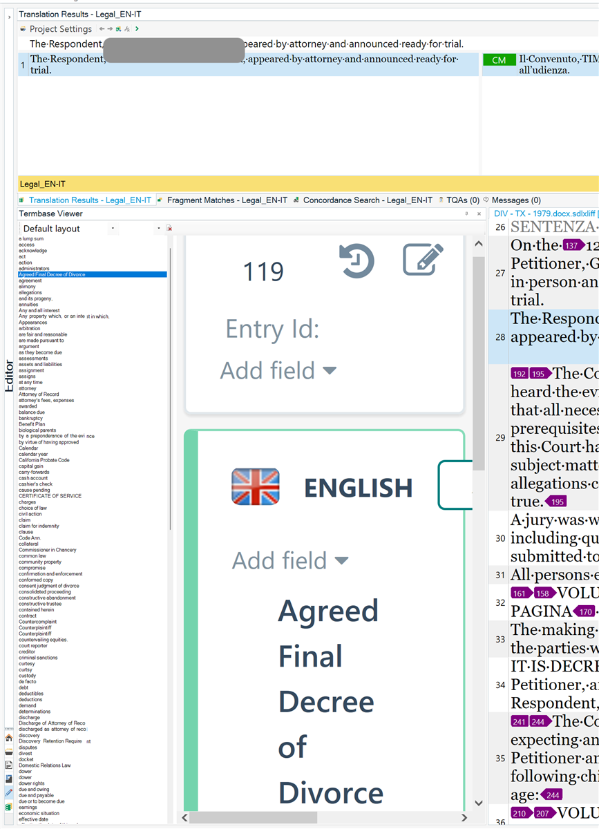
Termbase viewer extremely small

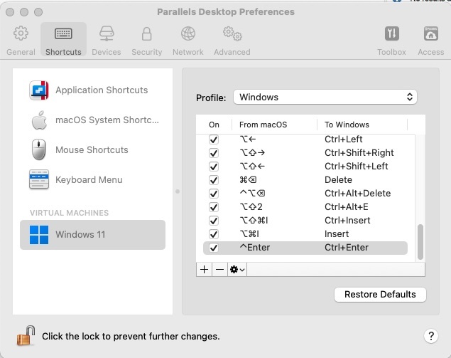
I am a 2021 SDL Trados Freelancer Pro user and I am using Parallels to run Win 11. Since forever, I have been having issues with the termbase viewer size  being very small, whereas the selected term is bigger. 

I have just installed the trial version of 2022 but the issue persists. 
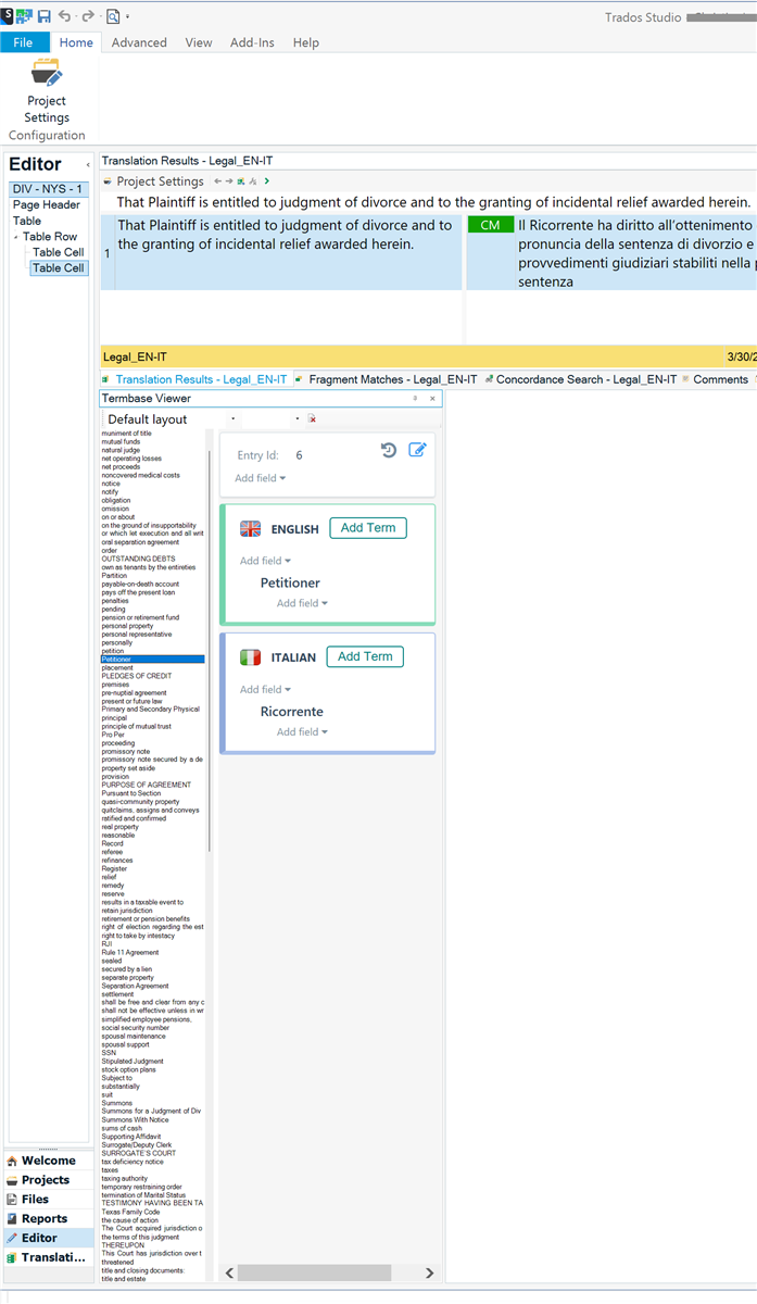
Screenshot of Trados Studio interface showing the Editor with a translation project open. The Termbase Viewer pane is displayed with a small font size for the term list, while the selected term 'Petitioner' in English and 'Ricorrente' in Italian is displayed in a larger font size.


Generated Image Alt-Text
[edited by: Trados AI at 2:47 AM (GMT 1) on 31 Mar 2024]
emoji
Parents Reply
  • I am using a trial version of 2022, but I have a license for 2021. Right now I am testing 2022. Adding a term or resetting the window layout changes the zoom of the right pane (the one where a single term is displayed) but it doesn't affect the left pane, where the term list is. 

    The right pane goes from incredibly small as the left pane to incredibly large that it can't be clicked as in my last screenshot. 

    The left pane (term list) is so small I can barely read it. 

    I don't really understand how this can be so random and while I understand that Trados was meant to be Windows-based, it is pretty frustrating since I am paying a yearly Parallels license just to run Trados, and Trados doesn't perform 100% anyway.

    I am just doing basic stuff (local projects with a TM and a TermBase)

    emoji
Children