Video tutorial
Overview and field description
You can customize any data entry form in the application. This could be useful in many different cases. For example, after creating a custom field, or to show different data to user depending on their role to hide unnecessary data and simplify view, or simply to change an order of columns depending on your preferences to enter data. Additionally, you could have different views to create new entities and edit them. In other words, detail view customization capabilities allow to create unique and optimized user experience when working with data by different types of users and roles.
To access detail views customization form, you must have administrative rights in the system.
To open, configuration screen, select Data entry form layouts in the Settings group of the navigation tree:
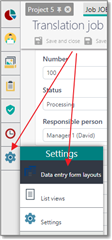
You will get to the following page:
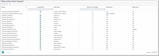
Here, you can find all list views existing in the system and control them from a single place. Here is a description of columns in this table:
- Name column displays descriptive name of a view.
- Is predefined column shows if a view is built-in or created by a user. Only custom views can be deleted or edited.
- Entity type shows type of a object which a view belongs to. Entity type specifies set of columns available for a view (table structure).
- Only for new entities specifies if a data entry form should be used only when user click New button to create an entity. Next, when an entity will be saved and opened again for editing, different view could be used.
- Target users field allow to specify users for which a view will be used by default. All value means that a view should be used for all users.
- Target roles, as target users, allows to assign a view to all users who belong to specific roles. In the same manner, it is possible to select All here.
Creating a new detail view
You can create a new view by cloning any existing (including predefined) view, or from scratch. It's always more convenient to clone existing view. To do this, just find an view for a desired entity type, select it and click clone:

In the result, view editing form will be displayed:
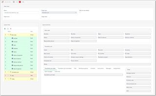
It contains a set of fields described above. Please provide some unique name and select Target users and Target roles. These fields allow to select multiple values (like tags), so you are able to select all necessary users or roles, or just select All value to make a view a default one for all users or roles. When user opens a form to edit a job, the application follows the following sequence:
- Searching a not predefined view (non-optional) where Target users value contains a name of a current user
- Searching a not predefined view (non-optional) where Target roles value contains a name of a current user's role
- Searching a not predefined view (non-optional) where Target roles and Target users value is All
- Searching a predefined view (non-optional) where Target users value contains a name of a current user
- Searching a predefined view (non-optional) where Target roles value contains a name of a current user's role
- Searching a predefined view (non-optional) where Target roles and Target users value is All
So, the most preferable view is custom view with a specified target user name, while the last view is a built-in view intended for all users and all roles.
Following this scheme you can create any number of views and distribute them across all users and roles existing in your system, so target users will get a view tuned for them. Also, you can further tune the experience by creating separate forms for creating and modifying entities. For example, when you create a job, it's required to specify a currency, but when editing a job, it could be worth to hide this field to save space and make other fields on a form easier to focus on.
In the main part of the view customization window you will find tree structure (on the left) and preview area (on the right). Any change which you make in the structure tree will immediately be reflected in the preview area. In a contrast to list views, in the left tree you can not only move and create new items, but combine them into groups. Groups may have captions and may be without captions. If group caption is specified, then fields from a group will be put inside framed area with a caption:

Any group can hold fields, as well as other groups. Each element (group, field, tabbed group or text) has a property named Columns. This property specifies width of an element. By default, width of each group equals to 12. This means that you can put 12 elements in a single row inside a group. If an element can't fit to a current row, it will be move to a next row. For example, if a group has two elements, with width of 10 and 3, then second element will be put in a next row.
Groups can be nested, and width of nested groups is independent of width of a parent group. Say, if nested group takes 50% of space of a parent group, then 12 elements inside nested group will be distributed along half of your screen width. It can be represented on the following screenshot:

Understanding a concept of 12 columns and groups, you can create layouts of any structure. Additionally, you can analyze built-in layouts (for example, translation job form) to understand mechanics better.
Layout tree allows to drag and drop any elements, put them inside and outside of groups. You can double click on any element to edit its properties (for example, to link an element with different field of an object).
To create a new element, click Add on the toolbar. The following dialog will appear:
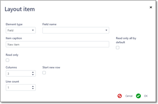
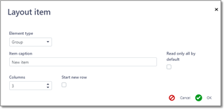
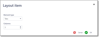
Element type. Allows to select what type of element you'd like to add (Field, Group, Tabs or Text).
Field name. Here you can select object field. If field is of reference type, then you will see Nested field box to select which exact property of a selected field you would like to include on a form. If any nested property is selected, then this field will be displayed only in read-only mode. To make it editable, please don't select any nested field here.
Item caption will be filled with some default value, but you can edit it as needed. Empty value here means that application will automatically determine caption from the internal model. If you specify caption directly, please note that if other users who will see this view are using TBM in different language, they will still see caption provided by you, as it becomes fixed (non-localizable).
Read only box allows to make a field non-editable on the form.
Columns value specifies amount of space occupied by an element. Can be from 1 to 12.
Start new row allows to force move an element to a new row, even if there is enough space in a current row to place it.
Line count is applicable only to string fields and control height of a field. For example, if a field may hold a lot of text (like Comments or Notes), then you may prefer to increase its height.
If to select other element type, then set of available fields in this form will change.
Group:
Tabs:
Static text:
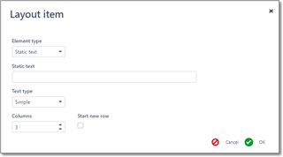
Text type here specifies a color used to highlight static text on the form (simple text - no color, info - blue, warning - orange, danger - red).
When you're ready, click OK to add a new element to the end of the tree structure. After that, you can move created element into any existing group and change its order in that group.
When you are done with changes and preview area displays acceptable results, click Save or Save and close to apply changes. If you get any error message, please fix issues and try to save again. After saving changes, you can try to open corresponding view in another tab of your browser to see how your changes where reflected in the application UI. If you're configuring a view for other users, you always can launch another browser, login there as another user and check how this user will see a view which you're configuring.
It may happen that in one of future application updates some field which you use in a custom view will be removed or even renamed. In this case, this field will disappear from your custom view. Please read version history before installing any update to find information about such changes. This is always provided in the Critical changes section.

 Translate