The raw data pulled from GroupShare has been designed to make it possible to create complex reports in as many ways as possible. This means there is a trade-off between how much granularity we wanted and how much skill you need in using Excel to get what you need. It also means a huge trade-off in terms of the time it takes to download data since the application is doing some very complex lookups between tables to pull the data in a way that makes it accessible for reporting.
Simple Reporting
For very simple reports you can of course use the filtering capabilities in Excel under the Home ribbon:
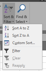
You can also add columns for your own calculations, and these can often be helpful to improve the more complex reporting by manipulating the data tables in Excel before creating your reports. It can take some thought to report accurately on what you need and to ensure you are not duplicating or omitting details. A good check is always to look in GroupShare and make sure you have the simple stuff right, such as number of organisations, or projects, as a cross check.
Detail Reporting
For detailed reporting your best bet is to use a Pivot Table. If you have not used these before here's a couple of useful tips.
Add to your Quick Access bar in Excel
This make it far easier and faster to access the menu item needed. First of all access the More Commands menu...:
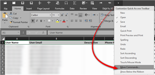
Select All Commands from the drop down and then Add>> using the add button the PivotChart & PivotTable to your list of commands that will be displayed in the Quick Access Toolbar:
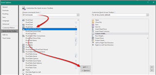
Now you can select all the data from your downloaded worksheet and start the Pivot creation process in one-click:
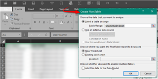
It's also worth noting that you probably need to check this option which is not selected by detail:

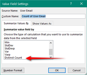
This is because it adds an additional value called Distinct Count to your choice when setting the Values field in your pivot. Without this you don't have this option and the results of yor reports may contain duplicate counts depending on how you compiled your report:
Pivot tables work by allowing you to drag and drop the fields you want from the field list at the top (essentially the column headings from your download) into the four different areas at the bottom:

You can manipulate this as much as you like and you'll soon get the idea of how useful this can be as you see the tables and charts being drawn automagically in front of you. Some good resources would be:

 Translate